Structured list
Color
By default, structured lists have a transparent background layer. Optionally, you can apply a colored background layer to a structured list. Structured lists with a colored background layer are only available in the hang alignment.
| Element | Property | Color token |
|---|---|---|
| Header text | text-color | $text-primary |
| Header row divider | border-bottom | $border-subtle * |
| Header (transparent option) | background-color | transparent |
| Header (background option) | background-color | layer * |
| Row text | text-color | $text-secondary * |
| Row divider | border-bottom | $border-subtle * |
| Row (transparent option) | background-color | transparent |
| Row (background option) | background-color | $layer * |
| Icon | icon-color | $icon-primary * |
* Denotes a contextual color token that will change values based on the layer it is placed on.
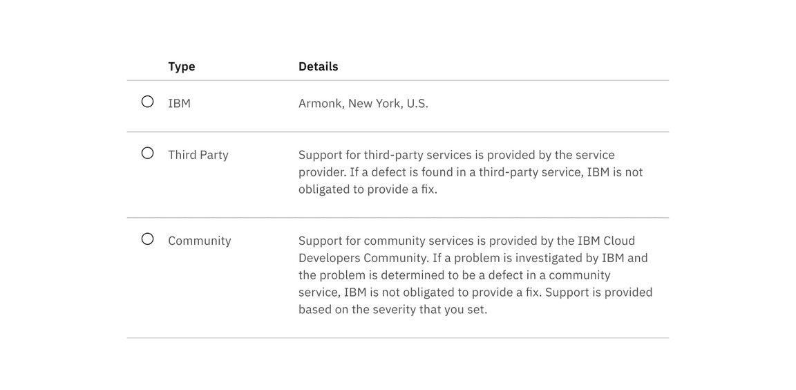
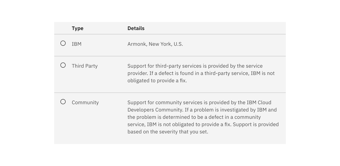
Interactive states
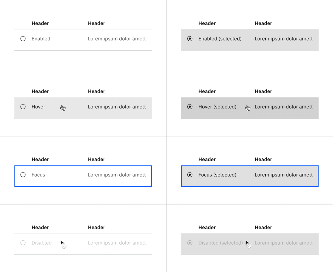
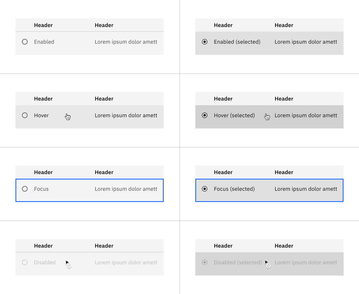
The structured list interactive states are shown below with its default transparent background layer and its optional color background layer.
| Element | State | Proptery | Color token |
|---|---|---|---|
| Enabled (selected) | Row | background-color | $layer-selected * |
| Row text | text-color | $text-primary | |
| Hover | Row | background-color | $layer-hover * |
| Row text | text-color | $text-primary | |
| Hover (selected) | Row | background-color | $layer-selected-hover * |
| Row text | text-color | $text-primary | |
| Focus | Row (transparent) | background-color | transparent |
| Row (background) | background-color | $layer * | |
| Border | border | $focus | |
| Focus (selected) | Row | background-color | $layer-selected * |
| Row text | text-color | $text-primary | |
| Border | border | $focus | |
| Disabled | Row (transparent) | background-color | transparent |
| Row (background) | background-color | $layer * | |
| Row text | text-color | $text-disabled | |
| Icon | inner fill | $icon-disabled | |
| Disabled (selected) | Row | background-color | $layer-selected * |
| Row text | text-color | $text-disabled | |
| Icon | inner fill | $icon-disabled |
* Denotes a contextual color token that will change values based on the layer it is placed on.
Typography
Structured list headings should be set in title case, while all other text is set in sentence case. All typography is left aligned.
| Element | Font-size (px/rem) | Font-weight | Type token |
|---|---|---|---|
| Heading | 14 / 0.875 | SemiBold / 600 | $heading-compact-01 |
| List text | 14 / 0.875 | Regular / 400 | $body-01 |
Structure
| Element | Property | px / rem | Spacing token |
|---|---|---|---|
| Structured list | min-width | 500 / 31.25 | – |
| Header | padding-top | 16 / 1 | $spacing-05 |
| padding-bottom | 8 / 0.5 | $spacing-03 | |
| padding-left, padding-right | 16 / 1 | $spacing-05 | |
| Row text | padding-top | 16 / 1 | $spacing-05 |
| padding-bottom | 24 / 1.5 | $spacing-06 | |
| padding-left, padding-right | 16 / 1 | $spacing-05 | |
| Icon | height, width | 16 / 1 | – |
Default structure
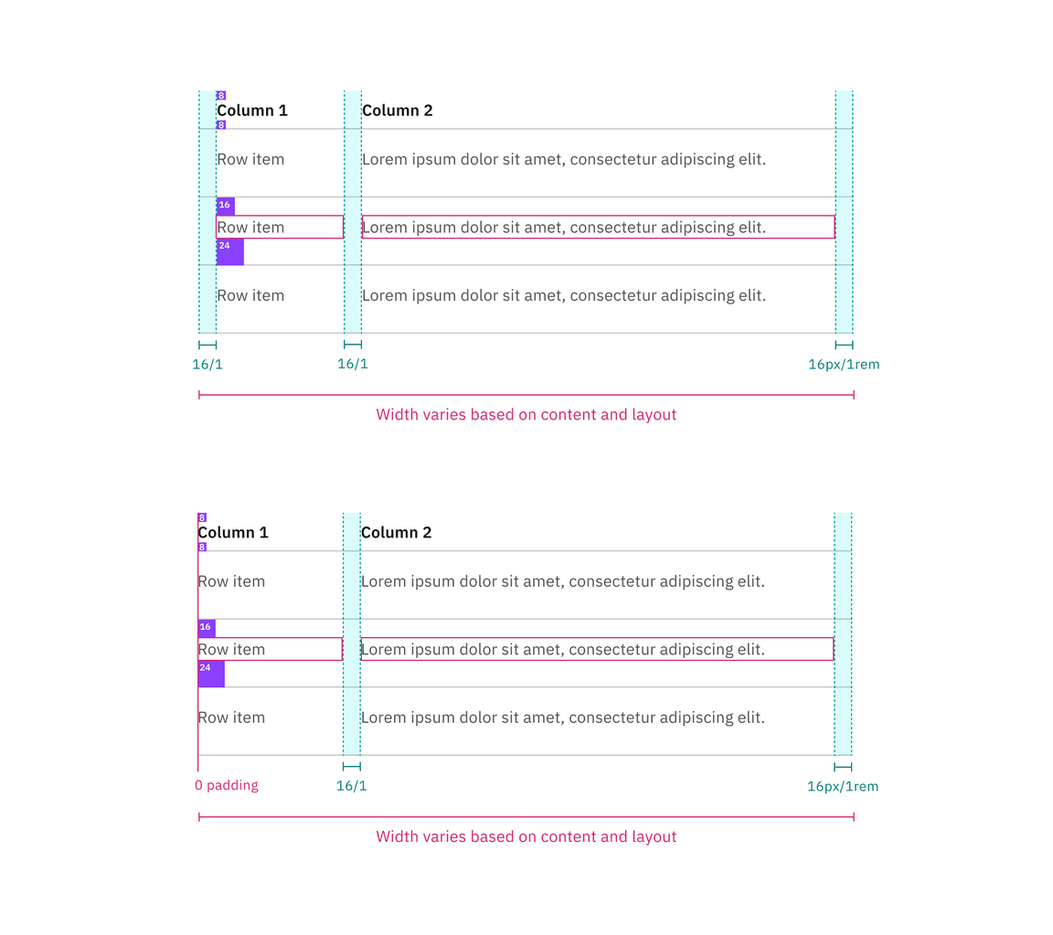
Spacing and measurements for default structured list with hang and flush alignment | px / rem.
Selectable structure
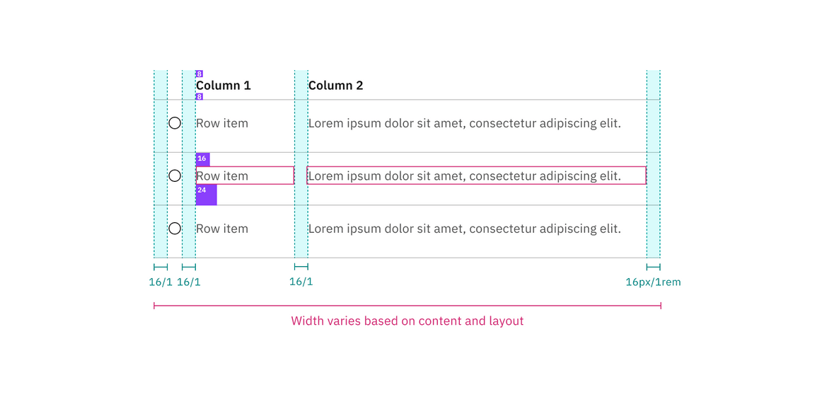
Spacing and measurements for selectable structured list with hang alignment | px / rem.
Size
There are two structured list sizes: default and condensed.
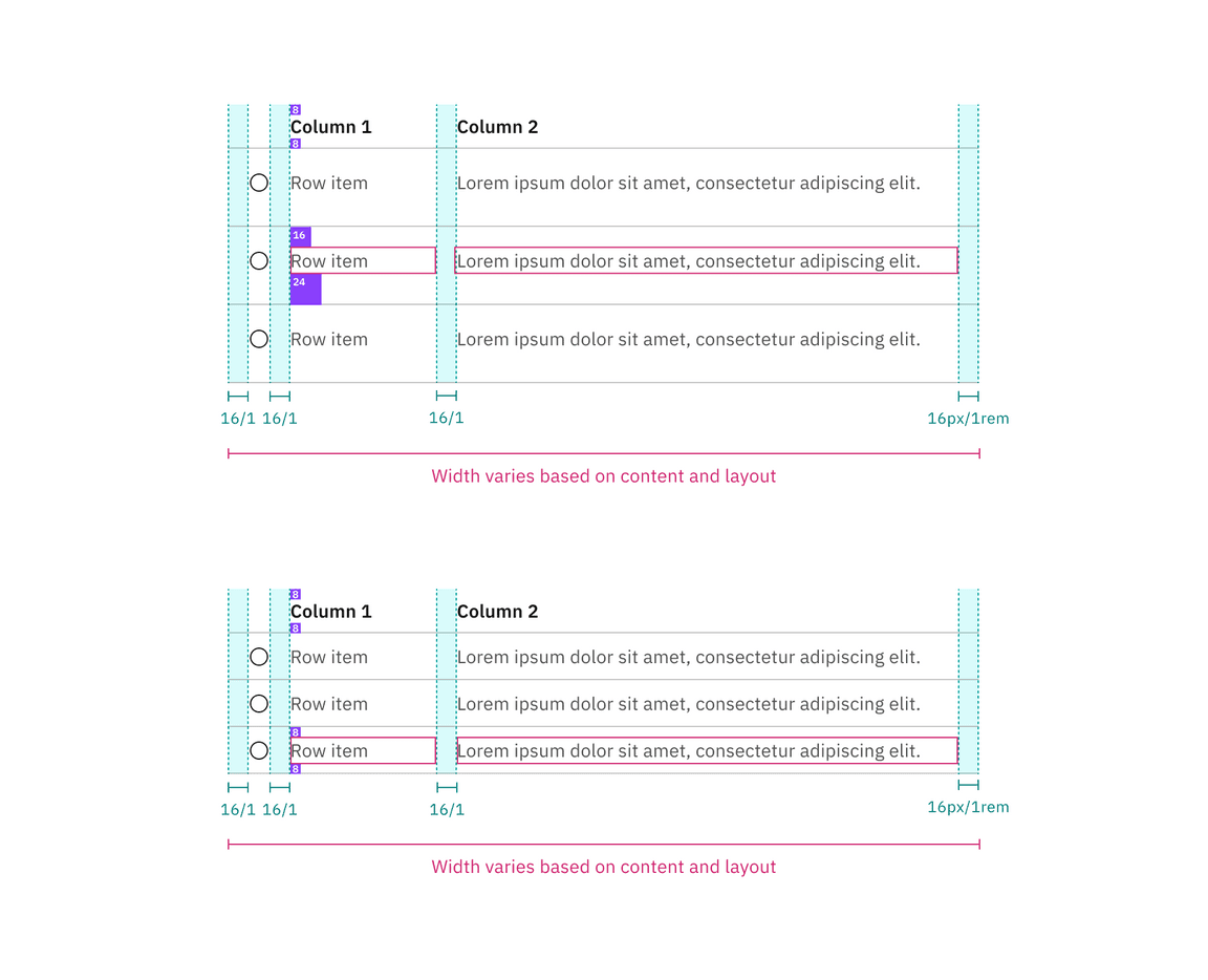
Default and condensed sizes for structured lists